Slider button
The slider button serves as a navigation element.
It can be used as a stand-alone or can be implemented into other components.
Overall styling#
- The icon can be adjusted to any arrow icon.
| Types | Attributes | Preview |
|---|---|---|
| Default | background-color: basic-white icon-color: basic-black | 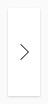 |
| Hover / focus | background-color: brand-primary-base icon-color: basic-white |  |
Spacing & measurements#
| Types | Attributes | Preview |
|---|---|---|
| Horizontal spacing | padding: 8px | 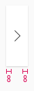 |
| Width | fixed to 32px | 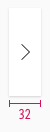 |
| Icon size | 16x16px | 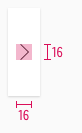 |
What can be modified?#
- Override the arrows.
- Adjust the width and height.
Our workflow in Sketch#
- The icon in the slider-button can be changed via the "Overrides"-function.
Change log#
Changed#
Doc: "Slider button" | Clean up the documentation for the right structure and sentence case
Changed#
- "Slider button" | Changed symbols: with layer-style settings