Forms
Forms are used to accept the user's input. They can be displayed in many different ways: input- or select-fields, check boxes or radio buttons. They serve to get information and guide the user through each task with minimal effort.
Possible use cases#
- Login and registration (check-in, check-out)
- Transaction (orders, payment)
- Contact (support, callbacks, requests)
- Data collection (lotteries, newsletters, surveys)
- Contribution (blogs, comments, posts)
Recommendations#
- Always try to keep the form and the text as short as possible!
- A short form helps the user to get a fast overview and to easily recognize what is required.
- If you use an input field as a single row or with a fixed height, demonstrate an overflow text (clipping) by an ellipse.
- If there is more than one option but only one can be selected, use a radio button instead of a checkbox.
Selection controls#
Overall styling#
- Text-style is basic.
- The line-height is set to default.
- Borders have a 2px thickness.
- Active states are always shown with a border in brand-primary-base.
- Icon size is 20x20px.
Checkbox#
- Choose a checkbox if the user must make one or more decisions about a particular element.
- Each checkbox in a group represents a separate and independent choice.
- Checked checkboxes use an embedded element as icon which isn't included in the icon sprite.
☀ Light mode styling for checkbox#
| States | Attributes | Preview |
|---|---|---|
| unselected default | text-color: greyscale/light-mode/general/high-contrast border: greyscale/light-mode/general/high-contrast |  |
| unselected active | text-color: brand-primary/base border: brand-primary/base |  |
| unselected disabled | text-color: greyscale/light-mode/general/low-contrast border: greyscale/light-mode/general/low-contrast |  |
| unselected error | text-color: orange/darker border: orange/base |  |
| selected default | text-color: brand-primary/base color: brand-primary/base icon-color: basic/white |  |
| selected active | text-color: brand-primary/base color: brand-primary/base icon-color: basic/white |  |
| selected disabled | text-color: greyscale/light-mode/general/low-contrast color: greyscale/light-mode/general/low-contrast icon-color: basic/white |  |
| selected error | text-color: orange/darker color: orange/base icon-color: basic/white |  |
☾ Dark mode styling for checkbox#
| States | Attributes | Preview |
|---|---|---|
| unselected default | text-color: greyscale/dark-mode/general/high-contrast border: greyscale/dark-mode/general/high-contrast |  |
| unselected active | text-color: brand-primary/light border: brand-primary/light | 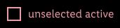 |
| unselected disabled | text-color: greyscale/dark-mode/general/low-contrast border: greyscale/dark-mode/general/low-contrast | 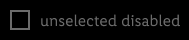 |
| unselected error | text-color: orange/light border: orange/base |  |
| selected default | text-color: brand-primary/light color: brand-primary/base icon-color: basic/white |  |
| selected active | text-color: brand-primary/light color: brand-primary/base icon-color: basic/white |  |
| selected disabled | text-color: greyscale/dark-mode/general/low-contrast color: greyscale/dark-mode/general/low-contrast icon-color: basic/white | 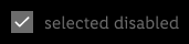 |
| selected error | text-color: orange/darker color: orange/base icon-color: basic/white |  |
Radio button#
- Choose a radio button if the user needs to select a single option from multiple options, or if you want the user to carefully consider the options and see all available ones.
- Selected radio buttons use our "bullet.svg" as icon.
☀ Light mode styling for radio button#
| States | Attributes | Preview |
|---|---|---|
| unselected default | text-color: greyscale/light-mode/general/high-contrast border: greyscale/light-mode/general/high-contrast |  |
| unselected active | text-color: brand-primary/base border: brand-primary/base |  |
| unselected disabled | text-color: greyscale/light-mode/general/low-contrast border: greyscale/light-mode/general/low-contrast |  |
| unselected error | text-color: orange/darker border: orange/base |  |
| selected default | text-color: brand-primary/base border: brand-primary/base icon-color: brand-primary/base |  |
| selected active | text-color: brand-primary/base border: brand-primary/base icon-color: brand-primary/base |  |
| selected disabled | text-color: greyscale/light-mode/general/low-contrast border: greyscale/light-mode/general/low-contrast icon-color: greyscale/light-mode/general/low-contrast |  |
| selected error | text-color: orange/darker border: orange/base icon-color: orange/base |  |
☾ Dark mode styling for radio button#
| States | Attributes | Preview |
|---|---|---|
| unselected default | text-color: greyscale/dark-mode/general/high-contrast border: greyscale/dark-mode/general/high-contrast |  |
| unselected active | text-color: brand-primary/light border: brand-primary/light | 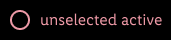 |
| unselected disabled | text-color: greyscale/dark-mode/general/low-contrast border: greyscale/dark-mode/general/low-contrast | 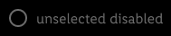 |
| unselected error | text-color: orange/light border: orange/base |  |
| selected default | text-color: brand-primary/light border: brand-primary/base icon-color: brand-primary/base |  |
| selected active | text-color: brand-primary/light border: brand-primary/base icon-color: brand-primary/base |  |
| selected disabled | text-color: greyscale/dark-mode/general/low-contrast border: greyscale/dark-mode/general/low-contrast icon-color: greyscale/dark-mode/general/low-contrast | 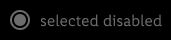 |
| selected error | text-color: orange/light border: orange/base icon-color: orange/base |  |
iOS selection#
- Used for multiple selections in iOS.
- Can be combined with iOS list component.
☀ Light mode styling for iOS selection#
| States | Attributes | Preview |
|---|---|---|
| unselected | outline-color: greyscale/light-mode/general/extra-low-contrast |  |
| selected | background-color: brand-primary/base icon-color: basic/white |  |
☾ Dark mode styling for iOS selection#
| States | Attributes | Preview |
|---|---|---|
| unselected | outline-color: greyscale/dark-mode/general/low-contrast |  |
| selected | background-color: brand-primary/base icon-color: basic/white |  |
Form fields#
Overall styling#
- Text-style for labels is basic-bold.
- Text style for hint and error text is small.
- Text style for the text inside input and selection fields is basic.
- The line-height is set to default.
- Borders have a 1px thickness.
- Active, success or error states for input and selection fields always have an inside aligned 2px border.
- Icon size is 24x24px.
- Blinking cursor in active state has brand-primary/base color.
Input field#
- Use input fields in the various states to show the user that data can be entered.
- They typically appear in forms and dialogs.
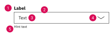
Input field anatomy#
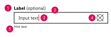
- Label
- Border
- Input text
- Icon
- Hint/error text
☀ Light mode styling for input fields#
| States | Attributes | Preview |
|---|---|---|
| default | label-color: greyscale/light-mode/general/high-contrast border-color: greyscale/light-mode/general/high-contrast border-thickness: 1px icon-color: greyscale/light-mode/general/high-contrast hint-color: greyscale/light-mode/general/high-contrast | 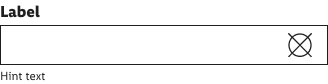 |
| active | label-color: greyscale/light-mode/general/high-contrast border-color: greyscale/light-mode/general/high-contrast border-thickness: 2px input-color: greyscale/light-mode/general/high-contrast icon-color: greyscale/light-mode/general/high-contrast hint-color: greyscale/light-mode/general/high-contrast | 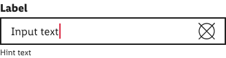 |
| disabled | label-color: greyscale/light-mode/general/low-contrast border-color: greyscale/light-mode/general/low-contrast border-thickness: 1px input-color: greyscale/light-mode/general/low-contrast icon-color: greyscale/light-mode/general/low-contrast hint-color: greyscale/light-mode/general/low-contrast | 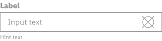 |
| success | label-color: greyscale/light-mode/general/high-contrast border-color: green/base border-thickness: 2px input-color: greyscale/light-mode/general/high-contrast icon-color: green/base hint-color: greyscale/light-mode/general/high-contrast | 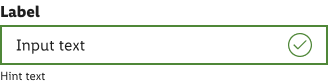 |
| error | label-color: greyscale/light-mode/general/high-contrast border-color: orange/base background-color: orange/lightest border-thickness: 2px input-color: orange/darker icon-color: orange/darker hint-color: orange/darker | 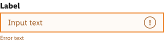 |
☾ Dark mode styling for input fields#
| States | Attributes | Preview |
|---|---|---|
| default | label-color: greyscale/dark-mode/general/high-contrast border-color: greyscale/dark-mode/general/high-contrast border-thickness: 1px input-color: greyscale/dark-mode/general/high-contrast icon-color: greyscale/dark-mode/general/high-contrast hint-color: greyscale/dark-mode/general/high-contrast | 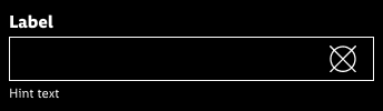 |
| active | label-color: greyscale/dark-mode/general/high-contrast border-color: greyscale/dark-mode/general/high-contrast border-thickness: 2px input-color: greyscale/dark-mode/general/high-contrast icon-color: greyscale/dark-mode/general/high-contrast hint-color: greyscale/dark-mode/general/high-contrast | 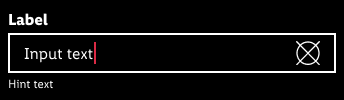 |
| disabled | label-color: greyscale/dark-mode/general/low-contrast border-color: greyscale/dark-mode/general/low-contrast border-thickness: 1px input-color: greyscale/dark-mode/general/low-contrast icon-color: greyscale/dark-mode/general/low-contrast hint-color: greyscale/dark-mode/general/low-contrast | 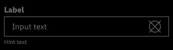 |
| success | label-color: greyscale/dark-mode/general/high-contrast border-color: green/light border-thickness: 2px input-color: greyscale/dark-mode/general/high-contrast icon-color: green/light hint-color: greyscale/dark-mode/general/high-contrast | 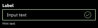 |
| error | label-color: greyscale/dark-mode/general/high-contrast border-color: orange/base border-thickness: 2px input-color: orange/light icon-color: orange/light hint-color: orange/light | 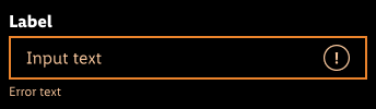 |
Select field#
- The select field is part of forms and opens a list of options.
- In Android tapping on the select field causes a standard menu with options (radio button choices) to appear.
- In iOS tapping on the select field causes wheels-style picker to appear in the bottom.
- The consistent appearance of a select field compared to other form elements (input field, checkbox, etc.) is important and also refers to the different states.
- Select fields use our "arrow-down.svg" as icon.
Select field anatomy#
- Label
- Border
- Input text
- Icon
- Hint/error text
☀ Light mode styling for select fields#
| States | Attributes | Preview |
|---|---|---|
| default | label-color: greyscale/light-mode/general/high-contrast border-color: greyscale/light-mode/general/high-contrast border-thickness: 1px input-color: greyscale/light-mode/general/high-contrast icon-color: greyscale/light-mode/general/high-contrast hint-color: greyscale/light-mode/general/high-contrast | 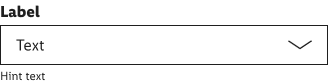 |
| active | label-color: greyscale/light-mode/general/high-contrast border-color: greyscale/light-mode/general/high-contrast border-thickness: 2px input-color: greyscale/light-mode/general/high-contrast icon-color: greyscale/light-mode/general/high-contrast hint-color: greyscale/light-mode/general/high-contrast | 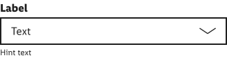 |
| disabled | label-color: greyscale/light-mode/general/low-contrast border-color: greyscale/light-mode/general/low-contrast border-thickness: 1px input-color: greyscale/light-mode/general/low-contrast icon-color: greyscale/light-mode/general/low-contrast hint-color: greyscale/light-mode/general/low-contrast | 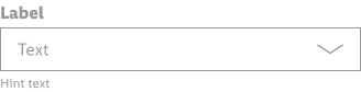 |
| error | label-color: greyscale/light-mode/general/high-contrast border-color: orange/base border-thickness: 2px background-color: orange/lightest input-color: orange/darker icon-color: orange/darker hint-color: orange/darker | 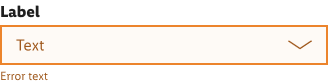 |
☾ Dark mode styling for select fields#
| States | Attributes | Preview |
|---|---|---|
| default | label-color: greyscale/dark-mode/general/high-contrast border-color: greyscale/dark-mode/general/high-contrast border-thickness: 1px input-color: greyscale/dark-mode/general/high-contrast icon-color: greyscale/dark-mode/general/high-contrast hint-color: greyscale/dark-mode/general/high-contrast | 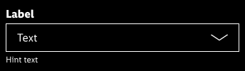 |
| active | label-color: greyscale/dark-mode/general/high-contrast border-color: greyscale/dark-mode/general/high-contrast border-thickness: 2px input-color: greyscale/dark-mode/general/high-contrast icon-color: greyscale/dark-mode/general/high-contrast hint-color: greyscale/dark-mode/general/high-contrast | 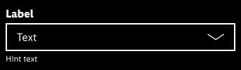 |
| disabled | label-color: greyscale/dark-mode/general/low-contrast border-color: greyscale/dark-mode/general/low-contrast border-thickness: 1px input-color:reyscale/dark-mode/general/low-contrast icon-color: greyscale/dark-mode/general/low-contrast hint-color: greyscale/dark-mode/general/low-contrast | 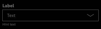 |
| error | label-color: greyscale/dark-mode/general/high-contrast border-color: orange/base border-thickness: 2px input-color:orange/light icon-color: orange/light hint-color: orange/light | 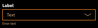 |
Labels#
- Labels are part of the input- or select field.
- They use basic-bold as label- and basic as optional-text.
- Give each form element a unique label.
- The (optional) part is fixed and is used for labels where user input isn't mandatory.
| States | Attributes | Preview | Combinations |
|---|---|---|---|
| default | text-color: greyscale/light-mode/general/high-contrast |  | 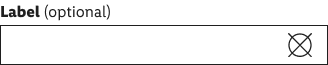 |
Spacing & measurements#
| Type | Attributes | Preview |
|---|---|---|
| horizontal | 8px margin between radio button (or checkbox) 16px padding between input box / input text and input text / icon |   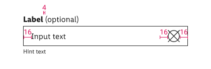 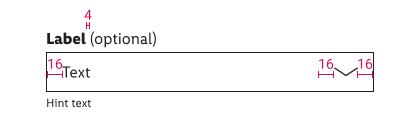 |
| vertical | 8px padding inside the unput box 2px between label / input box and input box / hint text 16px | 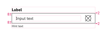 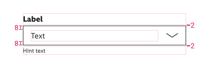 |
| icon size | 24px | 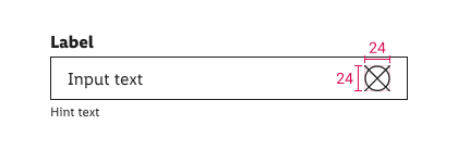 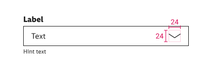 |
| distance | minimum 16px top to another component | 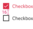  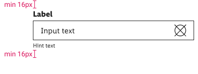 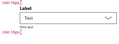 |
2.2.0 Parkside - 2021-12-07#
Added#
Figma,Doc: "Form" | Added iOS selection
2.1.0 Parkside - 2021-11-15#
Added#
Figma,Doc: "Form" | Added dark mode for input fields, select fields, radio buttons and checkboxes