Dialog
These components display the conversation between user and chatbot.
Overall styling#
- The text-style is basic.
- The line-height is set to default.
- The typing scenario is an animation in the frontend part (jumping bubbles changing their color), that is styled with the icon-color gray-darker and changed into transparency gradations.
- The typing scenario is an animation in the frontend part (jumping bubbles changing their color), that is styled with the icon-color of basic-white and -darker.
| Types | Attributes | Preview |
|---|---|---|
| User | text-color: basic-white background-color: brand-primary-base rounded-corners: 10px 10px 0px 10px | 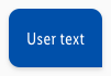 |
| Chatbot | text-color: gray-darker background-color: basic-white rounded-corners: 10px 10px 10px 0px | 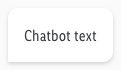 |
| Chatbot (typing) | icon-color: gray-darker background-color: basic-white rounded-corners: 10px 10px 10px 0px |  |
Spacing & measurements#
- The width and the height depends on the content length.
| Types | Attributes | Preview |
|---|---|---|
| Vertical spacing | padding: 16px | 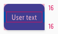 |
| Horizontal spacing | padding: 16px | 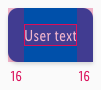 |
| Icon size | 12x12px icons are horizontally centered |  |
What can be modified?#
- Override the text elements.
- Press the two arrow icon on the override panel to adjust the size of the component.
In Sketch it looks like:
Change log#
2.0.0 Chat - 2021-07-22#
Highlights#
Sketch,Doc: "Dialog" | New layer-styles, text-styles and color-variables settings
Changed#
Doc: "Dialog" | Clean up the documentation for the right structure and sentence case