Badges
Use it for a number of functions, but mostly to demonstrate status and progress to the customer.
Basically they are positioned in the product tile or the tab bar.
Versions#
- There are different versions of the badge: standard and addon.
| Standard | Addon |
|---|---|
| Use it alone or in conjunction with text. | Use it in the user-navigation of the tab bar. |
Recommendations#
- If you decide to use a badge, never use more than a maximum of 2 variations.
- Label the badge clearly with short, scannable text and keep the text as short as possible.
Overall styling#
- The font-size depends on the component but is always basic bold.
- The line-height is 120%.
- The text-color always is basic-white.
- The border is in basic-white with a 1px thickness.
- It always has rounded corners of 50% of its height.
Standard#
- This badge is called standard it can be used alone or in conjunction with a text.
- It comes in 2 different sizes depending of the corresponding text-styles.
- The badge has 4 colored variations: primary, highlight, gray and info.
| Types | Attributes | Preview |
|---|---|---|
| Primary | text-style: small or basic background-color: brand-primary-base |  |
| Highlight | text-style: small or basic background-color: danger-base | 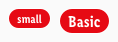 |
| Gray | text-style: small or basic background-color: gray-base | 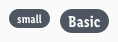 |
| Info | text-style: small or basic background-color: info-base | 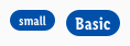 |
Addon#
- This badge is called addon and is only used in the user-navigation section of the tab bar.
| Attributes | Preview |
|---|---|
| font-size: 10px line-height: 100% text-color: basic-white background-color: brand-primary-base |  |
Spacing & measurements#
Standard#
| Types | Attributes | Preview |
|---|---|---|
| Horizontal spacing for small and basic badges | padding: 8px | 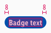 |
| Vertical spacing for small and basic badges | padding: 2px | 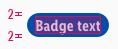 |
| Distances | margin: 8px | 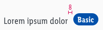 |
Addon#
| Types | Attributes | Preview |
|---|---|---|
| Horizontal spacing | padding: 4px |  |
| Size | 16px |  |
| Position | Overlaps an icon by 50% to the right Text expands the element to the left |  |
What can be modified#
- Override the text.
- Adjust the width according to the text.
- Modify badges to your project needs by changing colors of background, outline and text.
Change log#
Changed#
Doc: "Badge" | Clean up the documentation for the right structure and sentence case
Highlights#
Sketch: "Badge" | New layer-styles, text-styles and color-variables settings
Changed#
Doc: "Badge" | Updated documentation
Fixed#
- "Badge" | Fixed symbols: wrong padding
- "Badge" | Fixed description: font size for addon 12px to 10px